Mini-project I: Parameter estimation for a toy model of an EFT
The overall project goal is to reproduce various results in this paper: Bayesian parameter estimation for effective field theories. It’s a long paper, so don’t try to read all of it! (At least not now.) We’ll guide you to the relevant parts.
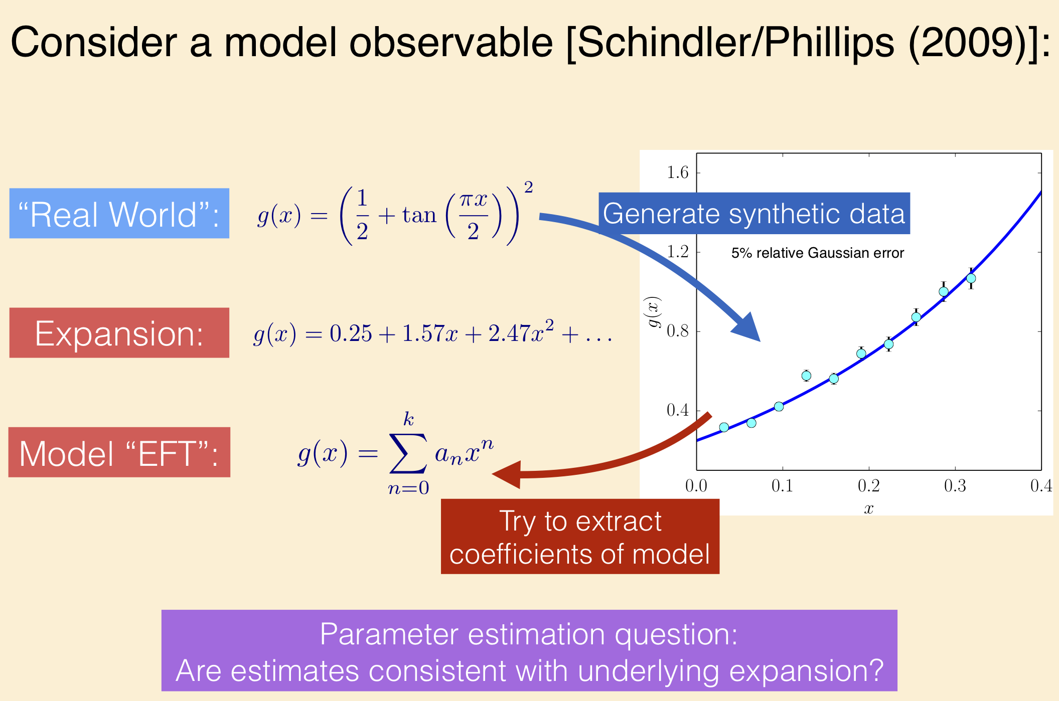
The paper uses toy models for effective field theories, namely Taylor series of some specified functions, to present guidelines for parameter estimation. This will also be a check of whether you can follow (or give you practice on) Bayesian statistics discussions in the physics literature.
You’ll find summaries in section II that touch on topics we have discussed and will discuss. The function
represents the true, underlying theory. It has a Taylor expansion
Our model for an EFT for this “theory” is
and your general task is to fit 1, 2, 3, … of the constants \(a_i\), and analyze the results. Your primary goal is to reproduce and interpret Table III on page 12 of the arXiv preprint. A secondary goal is to reproduce and interpret Figure 1 of the same paper. You should use the emcee sampler and corner to make plots.
Learning goals:
Apply and extend the Bayesian parameter estimation ideas and techniques from the course.
Explore the impact of control features: dependence on how much data is used and how precise it is; apply an informative prior.
Learn about some diagnostics for Bayesian parameter estimation.
Try out sampling on a controlled problem.
Suggestions for how to proceed:
Follow the lead of the notebooks Gaussian noise and Fitting a straight line II [ipynb].
Define a function for the exact result plus noise, noting from the arXiv paper what type of noise is added and where the points are located (i.e., what values of \(x\)).
Define functions for the two choices of prior and for the likelihood. Also a function for the posterior.
Call emcee to sample the posteriors.
Use corner to create plots. You can read the answers for the tables from the corner plots (it is also possible to extract the numbers directly: see the example at the bottom of this page from the emcee documentation).
Don’t try to do too much in your code at first (start with the lowest order in Table III).
Fill in the rest of Table III. Characterize and explain the different results from the two priors (also: which one is equivalent to standard least-squares fitting?).
Generate figures for the lowest orders analogous to Figure 1 and then reproduce Figure 1. Interpret the projected posteriors (e.g., what coefficients are very correlated and how does this relate to overfitting?) and identify where the “prior is returned”.
Comments and suggestions
To reproduce precisely (within fluctuations from the sampling) the numbers in Table III, you’ll need to use the same data set used in the table. This is available from the arXiv as D1_c_5.dat. These values are those plotted in the figure at the top of this notebook.
The 5% error is a relative error, meaning it is 0.05 times the data at that point. This means if you generate a Gaussian random number
errdistributed with standard deviation 0.05, the value of sigma for the log likelihood issigma[i] = data[i] * err(use the data, not the theory ati).The
show_titles=Trueoption to corner will show central results and one-\(\sigma\) error limits on the projected posterior plots.The
quantiles=[0.16, 0.5, 0.84]option to corner adds the dashed vertical lines to the marginal posteriors on the diagonal. You can obviously change the quantiles if you want another credibility region.The Python command
np.percentile(samples, [16, 50, 84],axis=0)might be useful to extract numerical values for the credibility region and the mean from a python arraysamplesof shape (nsamples,ndimensions).The example on Fitting a Model to Data from the emcee documentation may be useful to supplement the examples in the other notebooks.
Defining Python functions to do the sampling and plotting will make it much more efficient (and easier) to generate the numbers in the table or the particular plots for figure 1.
Bonus: additional subtasks
Do one or more of these to get a plus.
Reproduce Figures 3 and 4, showing the predictions with error bands for the two priors compared to the true function. You can use Matplotlib’s
fill_between(x, y-error, y+error)to make bands. (Use thealphakeyword forfill_between, e.g.,alpha=0.5, to make the bands more transparent.)Reproduce Figure 5 (alternative prior and “returning the prior”),
Reproduce Figure 6 (posterior for \(\overline a\)), and 7 (“relaxing to least squares”).
Reproduce Figure 9 (sensitivity to choice of \(x_{\rm max}\))
Repeat analysis with same function but different data precision and/or quantity (number of data points).
Repeat analysis with a different function from the paper or invent your own function and analyze.